Posts

Showing posts with the label #t mobile

Scale Transition in xamarin form

Image
  scale animation in xamarin form The animation in Xamarin will help you to make attractive and smooth transition.There are many method for animation. There are some example of method which will help you learn basic steps. The scale method increases or decreases the size of an element . Scaling refers to the resizing of an element. Scaling is used to change the visual appearance of an image, to alter the quantity of information stored in a scene representation, or as a low-level preprocessor in multi-stage image processing chain which operates on features of a particular scale. If you want to see result of scaling animation of this blog then click  here . ScaleTransition.xaml scale animation in xamarin form.  <ContentPage xmlns="http://xamarin.com/schemas/2014/forms" xmlns:x="http://schemas.microsoft.com/winfx/2009/xaml" x:Class="PageEffectUIDesigns.Views.ScaleTransition"> <ContentPage.Content> <Stack

Online Banking UI Designs in xamarin form

Image
  First we will create all template that required in above UI. You can copy code for CustomEntry from here . CardCircleImage.xaml <ContentView xmlns="http://xamarin.com/schemas/2014/forms" xmlns:x="http://schemas.microsoft.com/winfx/2009/xaml" x:Class="OnlineBankingUIDesigns.Controls.CardCircleImage"> <ContentView.Content> <StackLayout Padding="0,10,0,0" Margin="20,0,0,0"> <Frame x:Name="frame" HasShadow="True" HeightRequest="70" WidthRequest="70" CornerRadius="100" HorizontalOptions="Center" Padding="0"> <Image x:Name="img" Source="{Binding Img}" Aspect="AspectFill" /> </Frame> <Label Text="{Binding Name}" HorizontalOptions="Center" HorizontalTextAlignment="Center" TextColor="

Behavior Validation in Xamarin Form

Image
  Xamarin.Forms Behaviors are created by deriving from the Behavior or Behavior<T> class, where T is the type of the control (Entry, etc) to which the Behavior should apply. Create a new class and which inherits from the Behavior or Behavior<T> class. We need to override OnAttachedTo and OnDetachingFrom method from our validation class. The OnAttachedTo method is fired immediately after the behavior is attached to a control. This can be used to register event handlers or perform other setup that's required to support the behavior functionality. The OnDetachingFrom method is fired when the behavior is removed from the control. This method receives a reference to the control to which it is attached, and is used to perform any required cleanup. Register.xaml <ContentPage.Resources> <ResourceDictionary> <Style x:Key="baseStyle" TargetType="Label"> <Setter Property="XAlign&

Active Project

Image
  Active Project for Task Manager Code for Custom Entry Visit here Class for this Page Visit here ActiveProject.xaml <ContentPage xmlns="http://xamarin.com/schemas/2014/forms" xmlns:x="http://schemas.microsoft.com/winfx/2009/xaml" xmlns:TemplatedPage="clr-namespace:TaskManagerUIDesign.Views.Template" xmlns:custom="clr-namespace:TaskManagerUIDesign.Controls" x:Class="TaskManagerUIDesign.Views.ActiveProject" BackgroundColor="#F5F5F5" Title="Active Projects"> <ContentPage.Content> <ScrollView HorizontalOptions="Start" VerticalOptions="Start" > <StackLayout HorizontalOptions="FillAndExpand" VerticalOptions="FillAndExpand" > <Label Text="10 Projects are active." TextColor="Black" Margin="20,20,20,0"><

Custom Entry Renderer for Task Manager

Image
 Welcome to my blog.  Today we are going to learn how to create custom entry control. Custum Entry.cs Add this class in main project. public class CustomEntry : Entry { public static readonly BindableProperty BorderColorProperty = BindableProperty.Create(nameof(BorderColor), typeof(Color), typeof(CustomEntry), Color.Gray); // Gets or sets BorderColor value public Color BorderColor { get => (Color)GetValue(BorderColorProperty); set => SetValue(BorderColorProperty, value); } public static readonly BindableProperty BorderWidthProperty = BindableProperty.Create(nameof(BorderWidth), typeof(int), typeof(CustomEntry), Device.OnPlatform<int>(1, 2, 2)); // Gets or sets BorderWidth value public int BorderWidth { get => (int)GetValue(BorderWidthProperty); set => SetValue(BorderWidthProperty, value); }

Classes for Task manager UI

Image
  Visit  here  for code and more information of Task manager UI There are classes which is not defined above link. class definition are as below: public class TaskViewModel { public string TimeLeft { get; set; } public string Name { get; set; } public string Description { get; set; } public double ProgressValue { get; set; } public string Progress { get; set; } public string Status { get; set; } } public class TrackActivityViewModel { public string Time { get; set; } public string Comment { get; set; } public ImageSource Img { get; set; } } public class TrackActivityModel { public List<TaskViewModel> GetTask() { List<TaskViewModel> list = new List<TaskViewModel>(); list.Add(new TaskViewModel { Description = "dummy data is benign information that does not contain any useful data, but serves to reserve space where real data is

Task Manager UI Design

Image
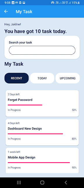
Task management app will help you to organize your task and team at one place. Easiest way to manage your project and task is to use task manager APP, Today we are going to learn some new UI for task manager app.  Following are UI : There are four page: Welcome Page Dashbaord Activity My Task   Welcome page will introduce your app. This page occurs as first page of application Welcome Page.xaml <ContentPage xmlns="http://xamarin.com/schemas/2014/forms" xmlns:x="http://schemas.microsoft.com/winfx/2009/xaml" x:Class="TaskManagerUIDesign.Views.WelcomePage" Shell.NavBarIsVisible="False" BackgroundColor="#DBE9F7" xmlns:control="clr-namespace:TaskManagerUIDesign.Controls"> <ContentPage.Content> <Grid HorizontalOptions="FillAndExpand" VerticalOptions="FillAndExpand" Padding="20"> <Grid.RowDefin